A camera photo can be much larger than its space on your site. Before uploading, decide whether the image is a small card, a large banner or a photo a customer needs to inspect closely. Keep the original elsewhere and publish a web-sized copy suited to that use.
Match the file to the photo’s job
Export web-friendly photos and compare their size and appearance. Crop banners so the important subject is visible on phones. For a gallery of finished projects, give each image reserved space so the page stays still while it loads. Avoid downloading the largest gallery version until a visitor opens it.
Keep important information readable
Put hours, prices and contact details in page text. If the photo shows a detail that contributes to the page, describe it in the alternative text. Photos can show the finish and color of a product while the page itself explains the dimensions, price and options.
Compare the same photo at each size
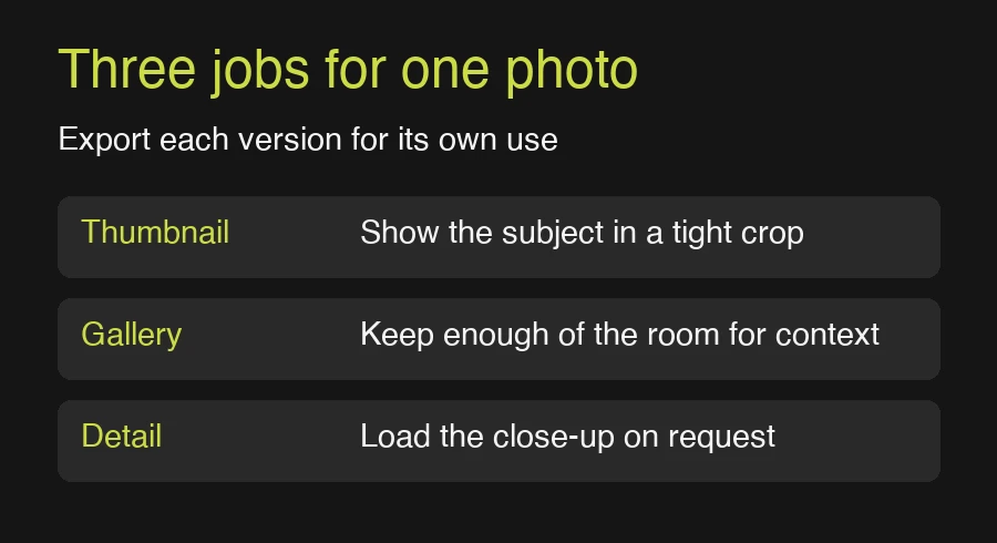
A builder’s portfolio photo might appear as a small tile on the home page, a wider gallery image, and a close-up customers can open. Judge all three at the size they actually display. A small tile can lose an important detail if it uses the same crop as a wide banner. A close-up can use more detail because the visitor has asked to see it.
- Pick a crop and use a small derivative for thumbnails.
- Create a wider version for the gallery and check that its biggest subject still fits a phone.
- Keep the full version for inspection or download if the customer needs it.
Make the gallery tell a story
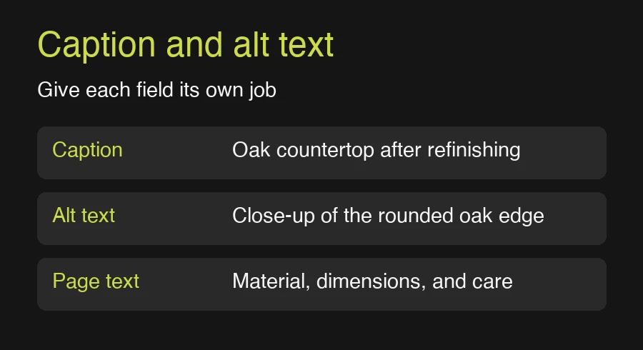
For a renovation gallery, one wide photo can show how the room is arranged, while a close-up can show the finish of a counter. Order them so readers understand the space before looking at the details. Use a caption for context that matters to everyone, such as the material or room. Use alternative text to convey visual information the caption leaves out. This gives the gallery a reason to exist and helps you cut photos that repeat the same information.